pacman::p_load(plotly, patchwork, hrbrthemes, ggridges, ggrepel, tidyverse, ggpubr, scales, colorspace, ggdist)Take Home Ex 1
Take Home Ex 1
Creating data visualisation beyond default
The Task
Assuming the role of a graphical editor of a median company, you are requested to prepare minimum two and maximum three data visualisation to reveal the private residential market and sub-markets of Singapore for the 1st quarter of 2024.
1 Data Preparation
1.1 Loading the Required Packages
1.2 Examining and Preparing the Data
We first read the 5 .csv files provided. These are separate csv files containing data of each of the quarters from 2023 to Mar 2024.
As such, we will use the following code chunk to import the data and combine them into a single dataset.
df <- list.files(path="data/csv", full.names = TRUE) %>%
  lapply(read_csv) %>%
  bind_rows
After combining the dataset into df, we will also extract the Sale Date and code it accordingly to the quarters. E.g. Jan to Mar 23 will be Q1Y23 and so on.
df <- df %>%
  mutate(sale_date = as.Date(`Sale Date`, format = "%d %b %Y"),
         quarter = paste0("Q", quarter(sale_date), "Y", format(sale_date, "%y")))%>%
  mutate(
    quarter = factor(quarter, levels = c("Q1Y23", "Q2Y23", "Q3Y23", "Q4Y23", "Q1Y24"))
  )
I also like to rename some of the columns headers so that it is easier to type into the codes later, especially removing the space in between.
realis2324 <- df %>%
  rename(
    unit_psm = 'Unit Price ($ PSM)',
    unit_area = 'Area (SQM)',
    property_type = `Property Type`,
    sale_type = `Type of Sale`,
    planning_region = `Planning Region`,
    planning_area = `Planning Area`,
    trans_price = `Transacted Price ($)`,
    project = `Project Name`
      )
1.3 Check Data for Duplicated, Missing Values
First, we check if there are any missing values in the dataset.
# Check for missing values
missing_values <- realis2324 %>%
  summarise_all(~ sum(is.na(.)))

# Display columns with missing values
print(missing_values)
# A tibble: 1 × 23
project trans_price `Area (SQFT)` `Unit Price ($ PSF)` `Sale Date` Address
<int> <int> <int> <int> <int> <int>
1 0 0 0 0 0 0
# ℹ 17 more variables: sale_type <int>, `Type of Area` <int>, unit_area <int>,
# unit_psm <int>, `Nett Price($)` <int>, property_type <int>,
# `Number of Units` <int>, Tenure <int>, `Completion Date` <int>,
# `Purchaser Address Indicator` <int>, `Postal Code` <int>,
# `Postal District` <int>, `Postal Sector` <int>, planning_region <int>,
# planning_area <int>, sale_date <int>, quarter <int>And also for any duplicated values.
# Check for duplicate rows
duplicate_rows <- realis2324 %>%
  filter(duplicated(.))

# Display duplicate rows
print(duplicate_rows)
# A tibble: 0 × 23
# ℹ 23 variables: project <chr>, trans_price <dbl>, Area (SQFT) <dbl>,
# Unit Price ($ PSF) <dbl>, Sale Date <chr>, Address <chr>, sale_type <chr>,
# Type of Area <chr>, unit_area <dbl>, unit_psm <dbl>, Nett Price($) <chr>,
# property_type <chr>, Number of Units <dbl>, Tenure <chr>,
# Completion Date <chr>, Purchaser Address Indicator <chr>,
# Postal Code <chr>, Postal District <chr>, Postal Sector <chr>,
# planning_region <chr>, planning_area <chr>, sale_date <date>, …1.4 Focusing on Individual Sales (i.e. Remove En Bloc)
Because we are looking at transaction data of the properties, we also want to check the number of units sold in each row is equal to 1. Because any sales with more than 1 unit can indicate other sales types, like en-bloc etc.
all_units_equal_to_1 <- all(realis2324$`Number of Units` == 1)

if (all_units_equal_to_1) {
  print("All values in the 'Number of Units' column are equal to 1.")
} else {
  # Print values above 1
  units_above_1 <- realis2324 %>%
    filter(`Number of Units` > 1)

  print("Values in the 'Number of Units' column above 1:")
  print(units_above_1)
}
[1] "Values in the 'Number of Units' column above 1:"
# A tibble: 12 × 23
project trans_price `Area (SQFT)` `Unit Price ($ PSF)` `Sale Date` Address
<chr> <dbl> <dbl> <dbl> <chr> <chr>
1 N.A. 32200000 14123. 2280 02 May 2023 "29,29…
2 KEW LODGE 66800000 25177 2653 23 May 2023 "34,34…
3 N.A. 6150000 4342. 1416 19 Jun 2023 "87 LO…
4 N.A. 10600000 6747. 1571 26 Jun 2023 "1,1A,…
5 CLAYMORE … 7000000 4209. 1663 27 Feb 2024 "6 CLA…
6 BAGNALL C… 115280000 68491. 1683 04 Jan 2023 "813,8…
7 MONDO MAN… 6280000 5490. 1144 18 Jan 2023 "543,5…
8 MEYER PARK 392180000 144883. 2707 09 Feb 2023 "81,83…
9 N.A. 61080008 32149. 1900 21 Mar 2023 "14,14…
10 EAST VIEW… 6100000 8338. 732 17 Jul 2023 "43,45…
11 N.A. 8000000 3659. 2187 28 Jul 2023 "4,6 L…
12 KARTAR AP… 18000000 6964. 2585 11 Oct 2023 "41A,4…
# ℹ 17 more variables: sale_type <chr>, `Type of Area` <chr>, unit_area <dbl>,
# unit_psm <dbl>, `Nett Price($)` <chr>, property_type <chr>,
# `Number of Units` <dbl>, Tenure <chr>, `Completion Date` <chr>,
# `Purchaser Address Indicator` <chr>, `Postal Code` <chr>,
# `Postal District` <chr>, `Postal Sector` <chr>, planning_region <chr>,
# planning_area <chr>, sale_date <date>, quarter <fct>We have 12 rows with the number of units > 1. Given that we are not able to divide the sales data accordingly by the number of units etc, we will remove these data instead.
realis2324_cleaned <- realis2324 %>%
  filter(`Number of Units` <= 1)
1.5 Reviewing the Property Type
When we look at the data, we can see that there are five property types indicated:
Apartment
Condominium
Detached House
Executive Condominium
Semi-Detached House
Terrace House
Executive Condominium is a mix between public and private housing so we will leave it as such in case we want to exclude it from further analysis. However, when we look at Apartment and Condominium, we realised that there is not much difference; e.g. one of the Apartment is Lentor Modern which is actually listed as a Condominium on its website. For the purpose of our study, we can therefore combine apartment and condominium as one same group - condo.
realis2324_cleaned$property_type <- ifelse(realis2324_cleaned$property_type == "Apartment", "Condominium", realis2324_cleaned$property_type)

realis2324_cleaned <- realis2324_cleaned %>%
  mutate(
    property_type = factor(property_type, levels = c("Condominium", "Executive Condominium", "Terrace House", "Semi-Detached House", "Detached House"))
  )
1.6 Writing the data to rds file
We will then write the data into a rds format.
write_rds(realis2324_cleaned, "data/rds/realis2324_cleaned.rds")2 Examining Resale Condo Prices
Reading the file from rds.
realis2324_cleaned <- read_rds ("data/rds/realis2324_cleaned.rds")2.1 Overview of the Private Property Transactions in Q1Y24
We will first start by providing an overview of the private property transactions in the Quarter 1 2024, by trying to answer the following questions:
- What is the proportion of sales in terms of property type across the quarters? We know that the bulk of transactions would involve Condominiums given their availability as compared to landed properties, but we also want to know the difference between resales/sub-sale as compared to new sales.
Code
g1 <- ggplot(subset(realis2324_cleaned, sale_type %in% c("Resale", "Sub Sale")), aes(x = quarter, fill = property_type)) +
  geom_bar(position = "dodge", color = "black") +
  geom_text(
    aes(label = ..count.., y = ..count.. + 50 ),
    stat = "count",
    size = 2,
    position = position_dodge(0.9),
    vjust=0)+
  theme(legend.position="none")+
  geom_hline(aes(yintercept = 2555), col="darkblue", linewidth=0.2, linetype = "dashed") +
   labs(
    title = "Resale Transactions for Condos in Q1Y24 is comparable to Q1Y23",
    x = "Quarters",
    y = "Number of Transactions"
  ) +
  scale_fill_brewer(palette = "Blues", name = "Property Type")

g1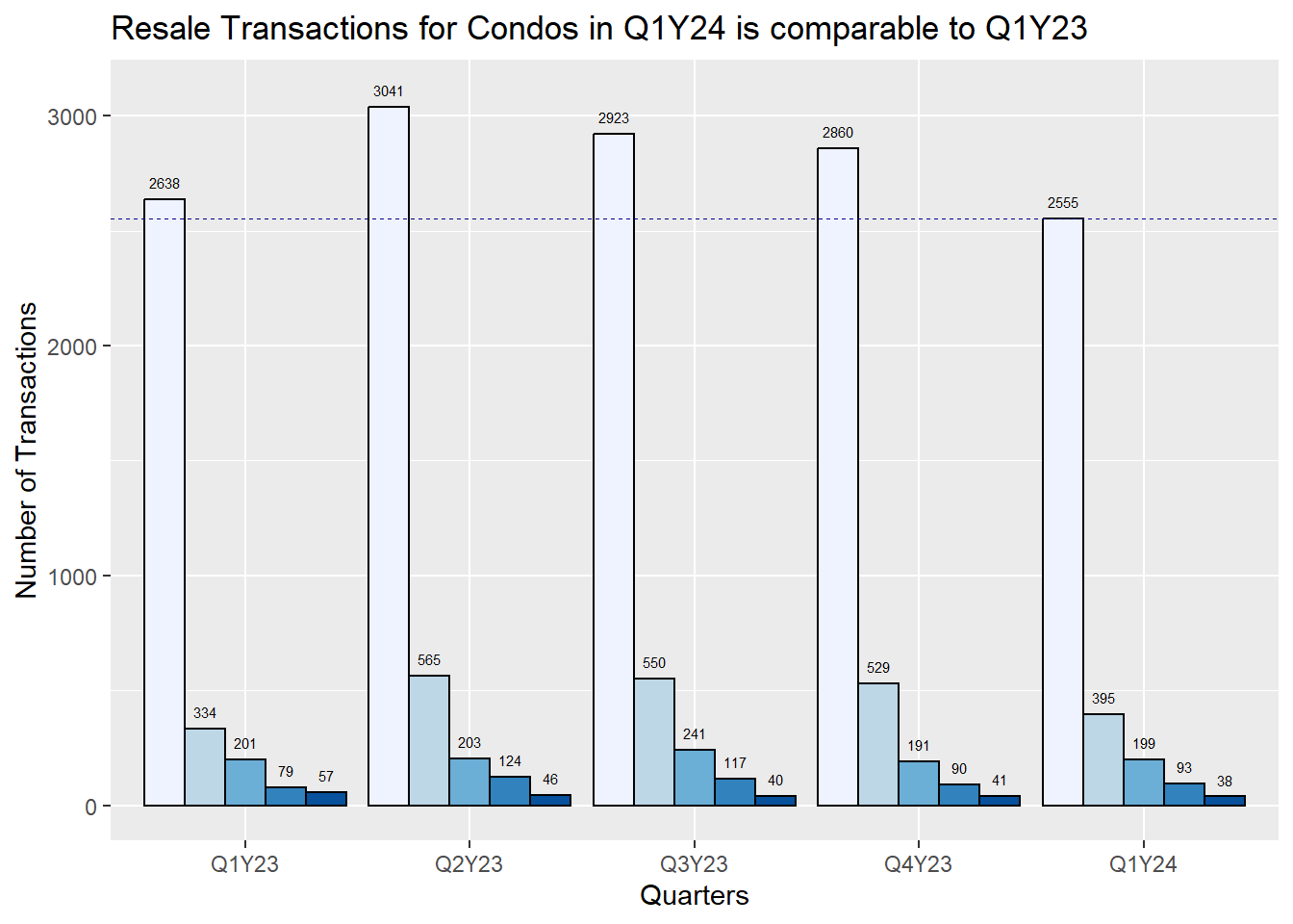
Code
g2 <- ggplot(subset(realis2324_cleaned, sale_type %in% "New Sale"), aes(x = quarter, fill = property_type)) +
  geom_bar(position = "dodge", color = "black") +
  geom_text(
    aes(label = ..count.., y = ..count.. + 50 ),
    stat = "count",
    size = 2,
    position = position_dodge(0.9),
    vjust=0)+
  geom_hline(aes(yintercept = 1154), col="darkblue", linewidth=0.2, linetype = "dashed") +
  labs(
    title = "New Sale Transactions for Condos in Q1Y24 is comparable to Q1Y23",
    x = "Quarters",
    y = "Number of Transactions"
  ) +
  scale_fill_brewer(palette = "Blues", name = "Property Type")

g2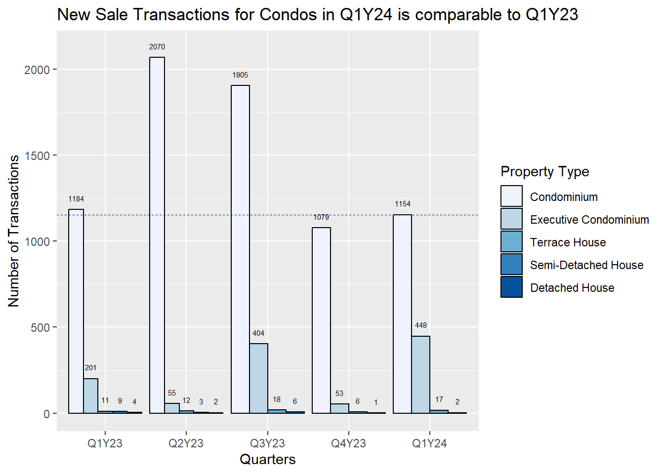
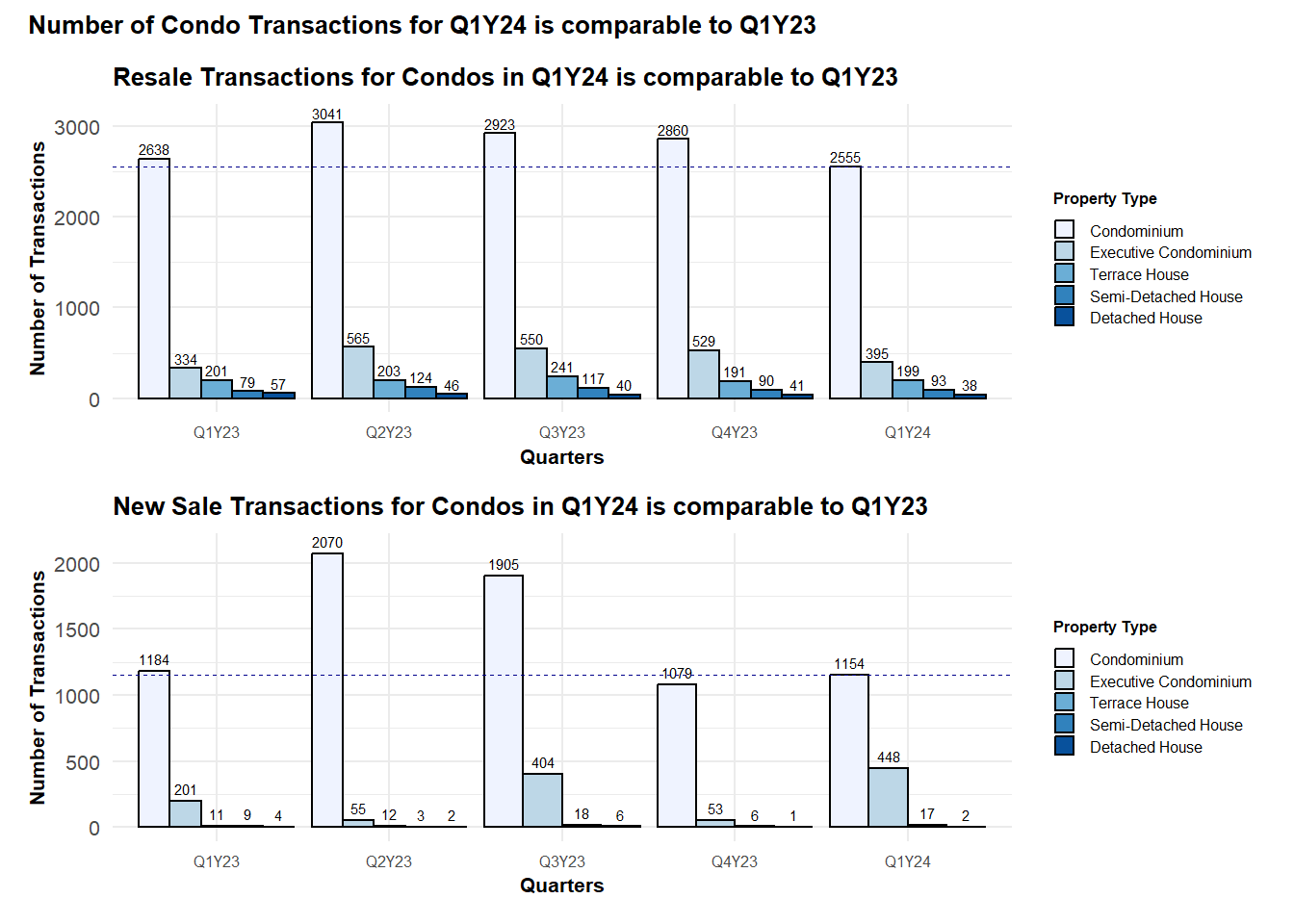
p = (g1 / g2) +
  plot_annotation('Number of Condo Transactions for Q1Y24 is comparable to Q1Y23')

p & theme_minimal()+
  theme(legend.key.size = unit(0.3, 'cm'), #change legend key size
        legend.key.height = unit(0.3, 'cm'), #change legend key height
        legend.key.width = unit(0.3, 'cm'), #change legend key width
        legend.title = element_text(size=6), #change legend title font size
        legend.text = element_text(size=6),
        title=element_text(size=8, face='bold'),
        axis.text.x = element_text(size = 6),
        axis.text.y = element_text(size = 8),
        )
Important
From the graph, we can see that the number of transactions for condominiums is a lot higher as compared to landed properties, with the number of both resale and new sales in Q1Y24 comparable to that in Q1Y23.
There are a higher number of new sales in Q2 and Q3 of the year, which is probably explained by the period when the developers like to launch their sales. We can also see that the new sales of landed properties pale in comparison to that of condominiums.
While the new sales in Q1Y24 is comparable to that in Q4Y23, the number of resale transactions decreased by about 305 which is about 10% decrease.
2.2 Transaction Price on Resale Condos
Next, we ask the following questions about the resale prices of condos:
- Has the overall transaction price of properties, focusing on resale Condominiums increased across the quarter, and year on year comparison for Q1Y24 as compared to Q1Y23?
First we look at the data in 2023 and compute some statistical values.
condo_subset23 <- realis2324_cleaned %>%
  filter(sale_type %in% c("Resale", "Sub Sale"),
         property_type == "Condominium",
         quarter %in% c("Q1Y23", "Q2Y23", "Q3Y23", "Q4Y23") )
resale23_mean <- round(mean(condo_subset23$trans_price))
resale23_median <- round(median(condo_subset23$trans_price))condo_subset24 <- realis2324_cleaned %>%
filter(sale_type %in% c("Resale", "Sub Sale"),
property_type == "Condominium",
quarter %in% c("Q1Y24") )
resale24_mean <- round(mean(condo_subset24$trans_price))
resale24_median <- round(median(condo_subset24$trans_price))
resaleunit24_median <- round(median(condo_subset24$unit_psm))
resalesize24_median <- round(median(condo_subset24$unit_area))
ymax <- as.numeric(round((IQR(condo_subset24$trans_price)*1.5) +
quantile(condo_subset24$trans_price,0.75)))
ymin <- as.integer(min(condo_subset24$trans_price))Next, we plot the histogram and box plots of the transaction prices of the resale condos (including those sub set sales), up to a limit of $5 million.
Code
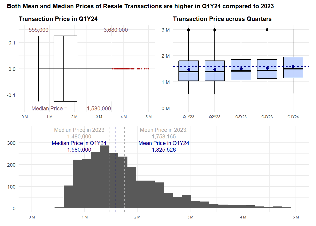
h_price <- ggplot(data= condo_subset24, aes(x= trans_price)) +
  geom_histogram(bins=30) +
  geom_vline(aes(xintercept = resale23_mean), col="darkgrey", linewidth=0.5, linetype = "dashed") +
  annotate("text", x=2500000, y=360, label="Mean Price in 2023:",
           size=3, color="darkgrey") +
  annotate("text", x=2500000, y=330, label=format(resale23_mean, big.mark = ","),
           size=3, color="darkgrey") +
  geom_vline(aes(xintercept = resale23_median), col="darkgrey", linewidth=0.5, linetype = "dashed") +
  annotate("text", x=900000, y=360, label="Median Price in 2023",
           size=3, color="darkgrey") +
  annotate("text", x=900000, y=330, label=format(resale23_median, big.mark = ","),
           size=3, color="darkgrey") +
  geom_vline(aes(xintercept = resale24_median), col="darkblue", linewidth=0.5, linetype = "dashed") +
  annotate("text", x=900000, y=300, label="Median Price in Q1Y24",
           size=3, color="darkblue") +
  annotate("text", x=900000, y=270, label=format(resale24_median, big.mark = ","),
           size=3, color="darkblue")+
    geom_vline(aes(xintercept = resale24_mean), col="darkblue", linewidth=0.5, linetype = "dashed") +
  annotate("text", x=2500000, y=300, label="Mean Price in Q1Y24",
           size=3, color="darkblue") +
  annotate("text", x=2500000, y=270, label=format(resale24_mean, big.mark = ","),
           size=3, color="darkblue") +
  scale_x_continuous(limits = c(0,5000000),labels = unit_format(unit = "M", scale = 1e-6)) +
  labs(
    x = "Transaction Price",
    y = "Number of Transactions"
  )
Code
b_price <- ggplot(data = condo_subset24, aes(y = trans_price)) +
  geom_boxplot(outlier.colour="firebrick", outlier.shape=16,
               outlier.size=0.6, notch=FALSE, width = 0.25) +
  coord_flip() + labs(y = "", x = "") +
  scale_y_continuous(limits = c(0,5000000), labels = unit_format(unit = "M", scale = 1e-6)) +
  theme(axis.text = element_blank(), axis.ticks = element_blank()) +
  stat_boxplot(geom="errorbar", width=0.25) +
  annotate("text", x=0.15, y=ymax, label=format(ymax, big.mark = ","),
           size=3, color="lightpink4") +
  annotate("text", x=0.15, y=ymin, label=format(ymin, big.mark = ","),
           size=3, color="lightpink4") +
  annotate("text", x=-0.15, y=3000000, label=format(resale24_median, big.mark = ","),
           size=3, color="lightpink4") +
  annotate("text", x=-0.15, y=1000000, label="Median Price =",
           size=3, color="lightpink4")+
  labs(title="Transaction Price in Q1Y24")
Code
condo_subset2324 <- realis2324_cleaned %>%
  filter(sale_type %in% c("Resale", "Sub Sale"),
         property_type == "Condominium")

bp_price <- ggplot(data=condo_subset2324,
       aes(y = trans_price, x= quarter)) +
  geom_boxplot(colour ="black", fill="#88abff", alpha=0.5) +
  geom_hline(aes(yintercept = resale24_median), col="darkblue", linewidth=0.5, linetype = "dashed") +
  geom_point(stat="summary",
             fun=mean,
             colour ="darkblue",
             size=2) +
  scale_y_continuous(limits = c(0,3000000),labels = unit_format(unit = "M", scale = 1e-6))+
  labs(title="Transaction Price across Quarters")
resale_price24 <- (b_price | bp_price) / h_price
p1 <- resale_price24 + plot_annotation(title = "Both Mean and Median Prices of Resale Transactions are higher in Q1Y24 compared to 2023")
p1 & theme_minimal() +
theme(title=element_text(size=8, face='bold'),
axis.text.x = element_text(size = 6),
axis.text.y = element_text(size = 8),
axis.title.y = element_blank(),
axis.title.x = element_blank(),
)
Important
From the graphs, we can observe that both the median and mean prices in Q1Y24 are higher as compared to that of 2023. The distribution of prices is also more right-skewed with the mean prices > median prices. When we look across the quarters, there also seem to be a gradual increase in the prices.
While the majority of the prices would fall between $1M to $2.2M, there are also quite a number of properties going for higher prices.
This is expected given that the transaction prices of properties are dependent on a variety of factors, mainly location, size of the units, age and many more.
2.3 Resale Condo Prices across Planning Regions in Q1Y24
Next we will zoom into Q1Y24 to examine the data and see if there is any trend relating to the number of transactions and prices.
Code
region_number <- ggplot(data = condo_subset24, aes(x = fct_infreq(planning_region))) +
  geom_bar(stat = 'count', position = "dodge", color = "black", fill = "#88abff") +
  labs(
    title = "Higher number of sales in Central Region",
    y = "Number of Transactions", x = "Planning Region"
  )

region_number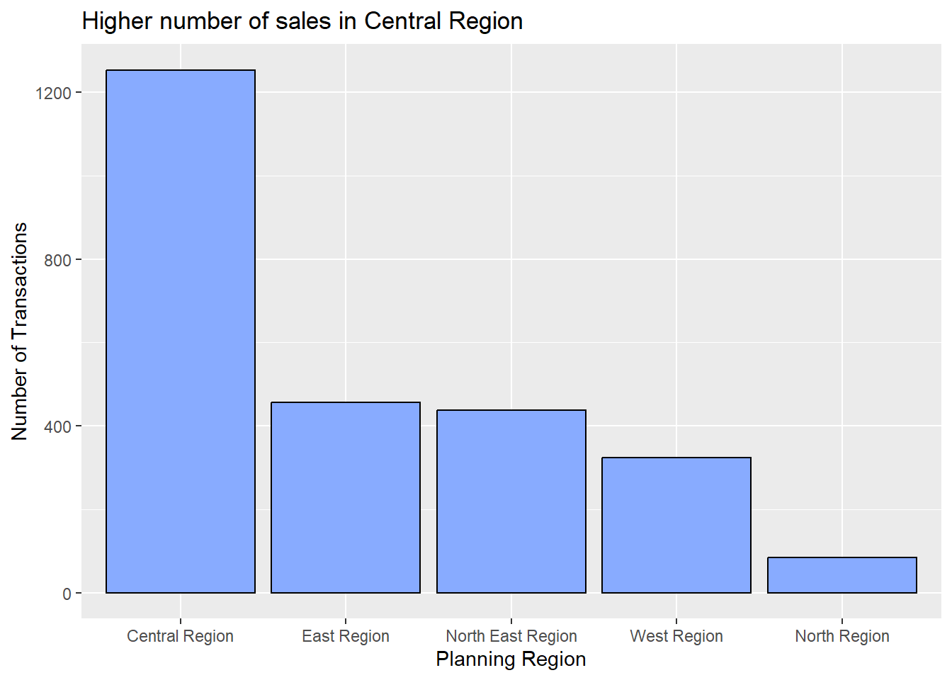
Code
region_size <- ggplot(data=condo_subset2324,
       aes(y = unit_area, x= fct_infreq(planning_region))) +
  geom_boxplot(colour ="black", fill="#88abff", alpha=0.5) +
  geom_point(stat="summary",
             fun=mean,
             colour ="darkblue",
             size=2) +
  geom_hline(aes(yintercept = resalesize24_median), col="red", linewidth=0.5, linetype = "dashed") +
  annotate("text", x=4.6, y=150, label="Median Unit Size",
           size=3, color="red") +
  annotate("text", x=4.6, y=130, label=format(resalesize24_median, big.mark = ","),
           size=3, color="red")+
  ylim(0,200) +
  labs(title="Unit Area of Condos Comparable", y = "Unit Area (sqm)", x = "Planning Region")

region_size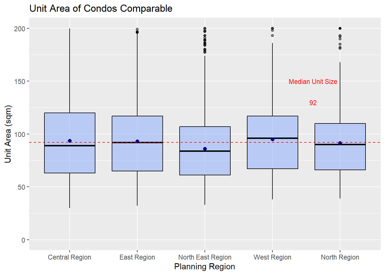
Code
region_unitprice <- ggplot(data=condo_subset2324,
       aes(y = unit_psm, x= fct_infreq(planning_region))) +
  geom_boxplot(colour ="black", fill="#88abff", alpha=0.5) +
  geom_hline(aes(yintercept = resaleunit24_median), col="red", linewidth=0.5, linetype = "dashed") +
  geom_point(stat="summary",
             fun=mean,
             colour ="darkblue",
             size=2) +
  annotate("text", x=4.6, y=30000, label="Median Unit Price",
           size=3, color="red") +
  annotate("text", x=4.6, y=27000, label=format(resaleunit24_median, big.mark = ","),
           size=3, color="red")+
  ylim(0,40000) +
  labs(title="Unit Price ($ sqm) higher in Central Region", y = "Unit Price ($ sqm)", x = "Planning Region")

region_unitprice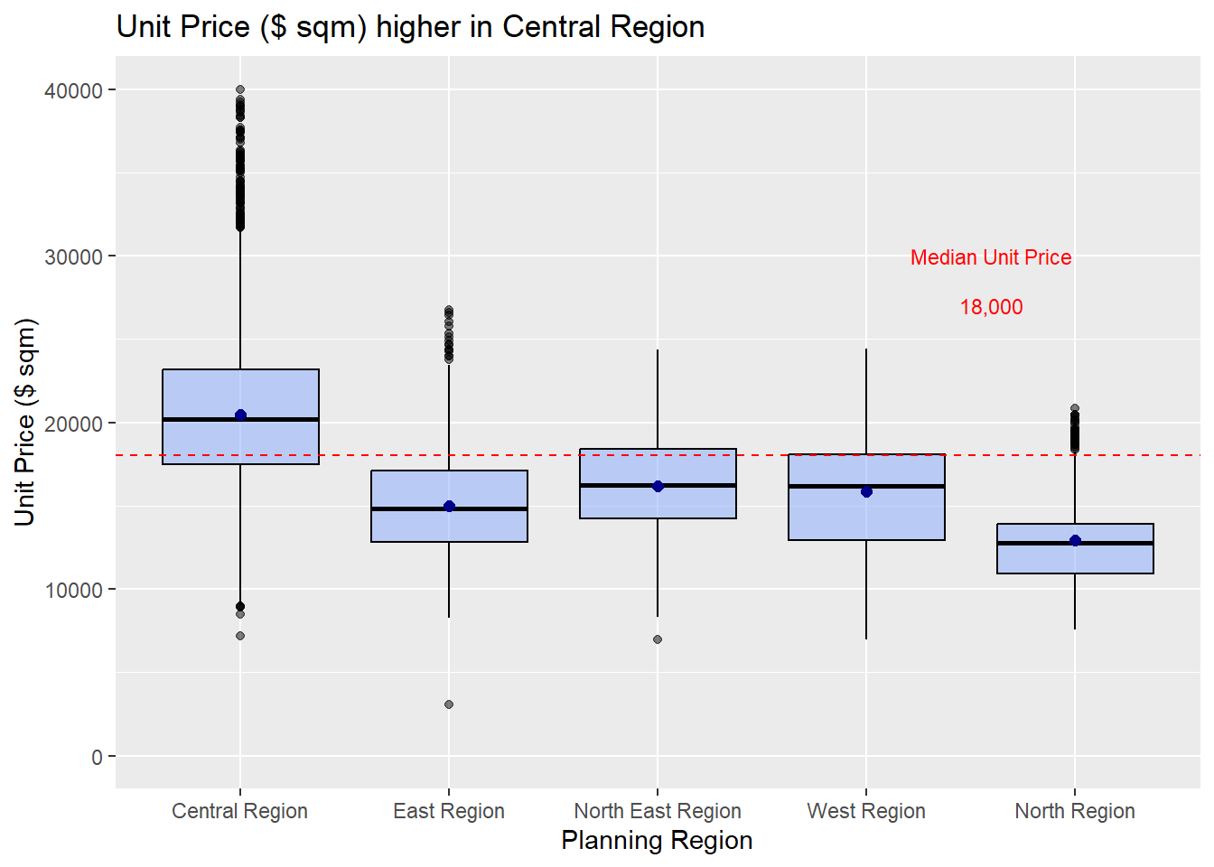
Code
resale_unitprice24 <- region_number | (region_size / region_unitprice)

p2 <- resale_unitprice24 + plot_annotation(title = "Number of Transactions and Prices higher for Central Region")

p2 & theme_minimal() +
  theme(title=element_text(size=8, face='bold'),
        axis.text.x = element_text(size = 6),
        axis.text.y = element_text(size = 8),
        axis.title.y = element_blank(),
        axis.title.x = element_blank(),
        )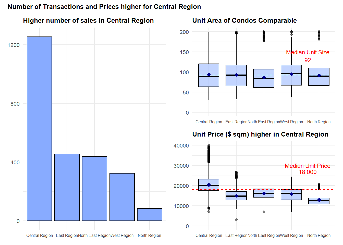
Important
Here we see that the number of transactions for resale condos in the central region is a lot higher compared to the other regions, and the median price in the central region is also higher compared to the overall median price.
The size of the units remain somewhat comparable across the regions, indicating the preference of buyers in this current climate.
3 Examining the New Sales Data
Next, we want to know what are the new sales in Q1Y24 and the prices transacted to understand if there is a range of prices within these projects and how big is this variance.
First, we filter the data:
condo_new_subset24 <- realis2324_cleaned %>%
  filter(sale_type %in% c("New Sale"),
         property_type == "Condominium",
         quarter %in% c("Q1Y24") )
Next, we see which are the top 10 new sales and the projects.
Code
# Select top 10 projects based on transaction count
top_10_projects <- condo_new_subset24 %>%
  count(project) %>%
  top_n(10, wt = n)

# Subset the original data frame to include only the top 10 projects
condo_top_10 <- condo_new_subset24 %>%
  filter(project %in% top_10_projects$project)

# Define custom colors for Lentor Projects and Others
custom_colors <- c("Lentor Projects" = "brown", "Others" = "grey50")

# Plotting code
condo_top10 <- ggplot(data = condo_top_10,
                      aes(x = fct_rev(fct_infreq(project)),
                          fill = factor(ifelse(project %in% c("LENTORIA", "LENTOR MANSION", "LENTOR HILLS RESIDENCES", "HILLOCK GREEN"),
                                               "Lentor Projects", "Others")))) +
  geom_bar(stat = 'count', position = "dodge", color = "black") +
  scale_fill_manual(name = "Project Category", values = custom_colors) + # Specify colors
  labs(
    title = "4 out of 10 projects are situated in Lentor",
    y = "Number of Transactions", x = "Projects"
  ) +
  coord_flip() +
  theme(legend.position = "bottom")

# Print the plot
condo_top10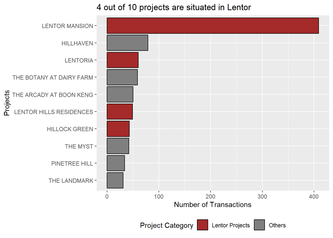
Next, we plot the ridge plot to take a look at the unit price (S$ psm).
Code
condo_ridge <- ggplot(condo_top_10,
       aes(x = unit_psm,
           y = project,
           fill = factor(stat(quantile))
           )) +
  stat_density_ridges(
    geom = "density_ridges_gradient",
    calc_ecdf = TRUE,
    quantiles = c(0.025, 0.975)
    ) +
  scale_fill_manual(
    name = "Probability",
    values = c("lightblue", "lightgrey", "darkblue"),
    labels = c("(0, 0.025]", "(0.025, 0.975]", "(0.975, 1]"), guide = "none"
    ) +
  labs(title="High Variance of Unit Price across Projects", y = "Projects", x = "Unit Price ($psm)")
Further zoom into the Lentor Projects, namely - Lentoria, Lentor Mansion, Lentor Hill Residences, Hillock Green.
condo_lentor <- condo_new_subset24 %>%
  filter(project %in% c("LENTORIA", "LENTOR MANSION", "LENTOR HILLS RESIDENCES", "HILLOCK GREEN"))


condo_lentor_plot <- ggplot(condo_lentor,
       aes(x = project,
           y = unit_psm)) +
  stat_halfeye(adjust = 0.5,
               justification = -0.2,
               .width = 0,
               point_colour = NA) +
  geom_boxplot(width = .20,
               outlier.shape = NA) +
  stat_dots(side = "left",
            justification = 1.2,
            binwidth = .5,
            dotsize = 1.5) +
  coord_flip() +
  labs(title="Higher Prices for Lentor Mansion", y = "Projects", x = "Unit Price ($psm)")
Code
g1 <- condo_top10 | (condo_ridge / condo_lentor_plot)

g2 <- g1 + plot_annotation(title = "New Sales in Lentor for Q1Y24 with Lentor Mansion commanding a higher price")

g2 & theme_minimal() +
  theme(title=element_text(size=7, face='bold'),
        axis.text.x = element_text(size = 5),
        axis.text.y = element_text(size = 5),
        axis.title.y = element_blank(),
        axis.title.x = element_blank(),
        legend.position = "bottom"
        )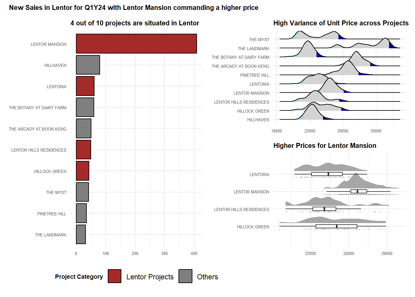
Important
Here we examine the number of new sales in Q1Y24, focusing on the top 10 condo projects.
We notice that there is a concentration of new releases in the Lentor area, with 4 new projects being sold. That said, we observe that the unit price varies within the project and also across the projects even in Lentor.
From the graph, we also notice that the unit price for Lentor Mansion is higher compared to the neighbouring projects. So we know that there is a premium to be paid for this project - which could be due to the developer, and the new GFA harmonisation rules (no more space wastage shenanigans).
References
Can refer to the textbook by Prof Kam for the functions written in this exercise, namely: