pacman::p_load(ggrepel, patchwork,
               ggthemes, hrbrthemes,
tidyverse) Hands On Ex 2
2 Beyond ggplot2 Fundamentals
2.1 Overview
In this exercise, we will look at using extensions to create more elegant and effective statistical graphics, mainly using these four packages:
ggrepel: an R package provides geoms for ggplot2 to repel overlapping text labels.
ggthemes: an R package provides some extra themes, geoms, and scales for ‘ggplot2’.
hrbrthemes: an R package provides typography-centric themes and theme components for ggplot2.
patchwork: an R package for preparing composite figure created using ggplot2.
2.2 Loading the Packages
2.3 Importing the Data
We will be using the data from Ex 1 - which is the exam grades of a cohort of Primary 3 students from a local school, which is stored in a csv file.
exam_data <- read_csv("data/Exam_data.csv")The data comprises seven columns - 4 categorical (ID, Class, Gender and Race) and 3 continuous data (Scores for English, Maths and Science).
2.4 Annotations using ggrepel
One of the key challenge in plotting is annotations, especially with a large number of data points.
Here we use the ggplot2 to look at the English Score vs Maths Score.
Code
ggplot(data=exam_data,
       aes(x= MATHS,
           y=ENGLISH)) +
  geom_point() +
  geom_smooth(method=lm,
              linewidth=0.5) +
  geom_label(aes(label = ID),
             hjust = .5,
             vjust = -.5) +
  coord_cartesian(xlim=c(0,100),
                  ylim=c(0,100)) +
  ggtitle("English scores versus Maths scores for Primary 3")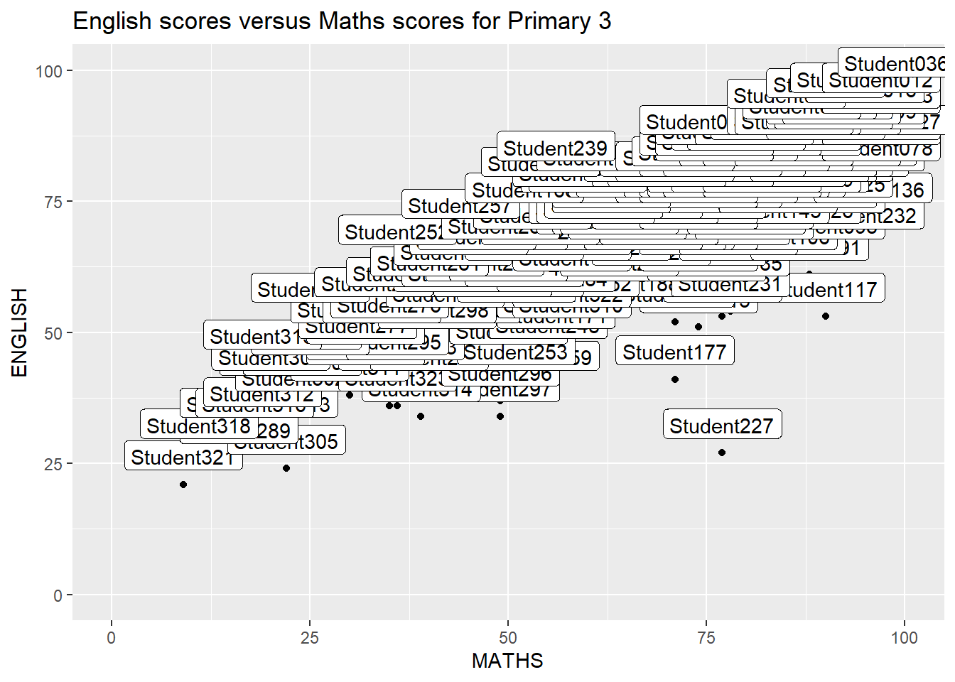
Which is quite messy.
ggrepel is an extension of ggplot2 package which provides geoms for ggplot2 to repel overlapping text as in our examples on the right.
We replace geom_text() with geom_text_repel() and geom_label() with geom_label_repel.
ggplot(data=exam_data,
       aes(x= MATHS,
           y=ENGLISH)) +
  geom_point() +
  geom_smooth(method=lm,
              size=0.5) +
  geom_label_repel(aes(label = ID),
                   fontface = "bold") +
  coord_cartesian(xlim=c(0,100),
                  ylim=c(0,100)) +
  ggtitle("English scores versus Maths scores for Primary 3")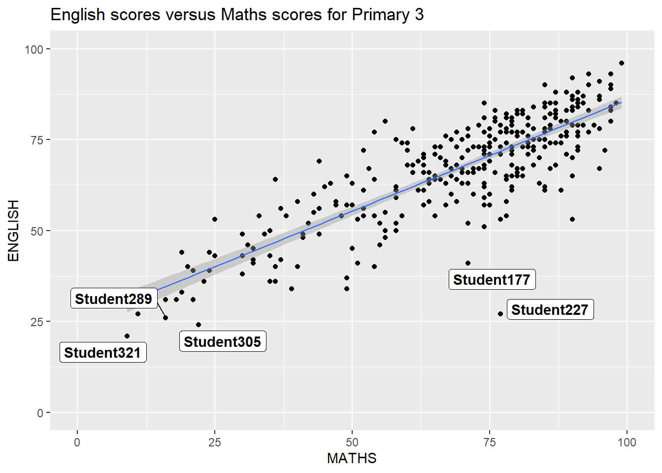
2.5 Themes
ggplot comes with built-in themes refer to the link for more details. Below is an example using theme_gray().
Code
ggplot(data=exam_data,
             aes(x = MATHS)) +
  geom_histogram(bins=20,
                 boundary = 100,
                 color="grey25",
                 fill="grey90") +
  theme_gray() +
ggtitle("Distribution of Maths scores") 
2.5.1 Using ggtheme package
ggthemes provides ‘ggplot2’ themes that replicate the look of plots by Edward Tufte, Stephen Few, Fivethirtyeight, The Economist, ‘Stata’, ‘Excel’, and The Wall Street Journal, among others.
In the example below, The Economist theme is used.
Code
ggplot(data=exam_data,
             aes(x = MATHS)) +
  geom_histogram(bins=20,
                 boundary = 100,
                 color="grey25",
                 fill="grey90") +
  ggtitle("Distribution of Maths scores") +
  theme_economist()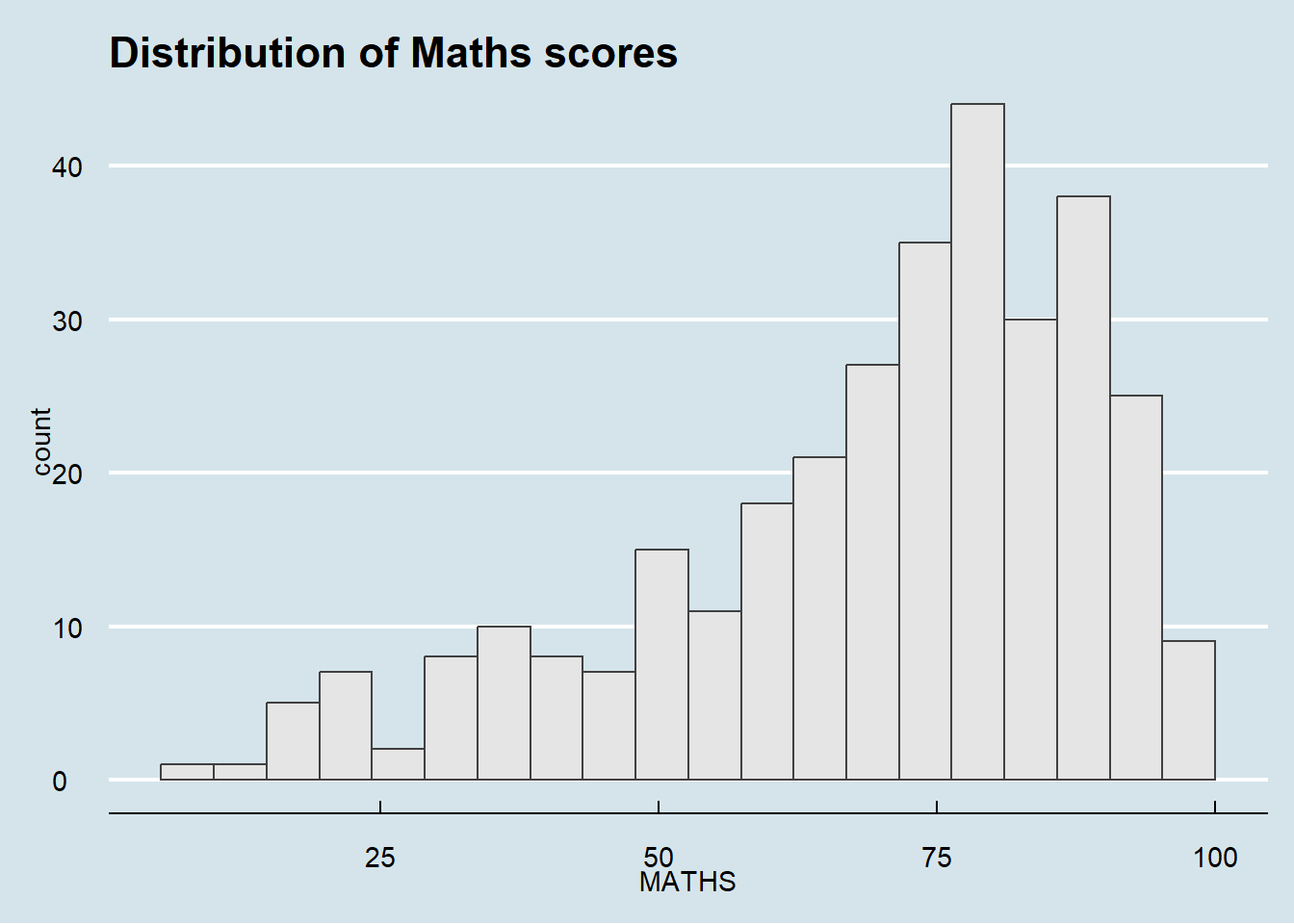
It also provides some extra geoms and scales for ‘ggplot2’. Consult this vignette to learn more.
2.5.2 Using hrbthems package
hrbrthemes package provides a base theme that focuses on typographic elements, including where various labels are placed as well as the fonts that are used.
Code
ggplot(data=exam_data,
             aes(x = MATHS)) +
  geom_histogram(bins=20,
                 boundary = 100,
                 color="grey25",
                 fill="grey90") +
  ggtitle("Distribution of Maths scores") +
  theme_ipsum_rc()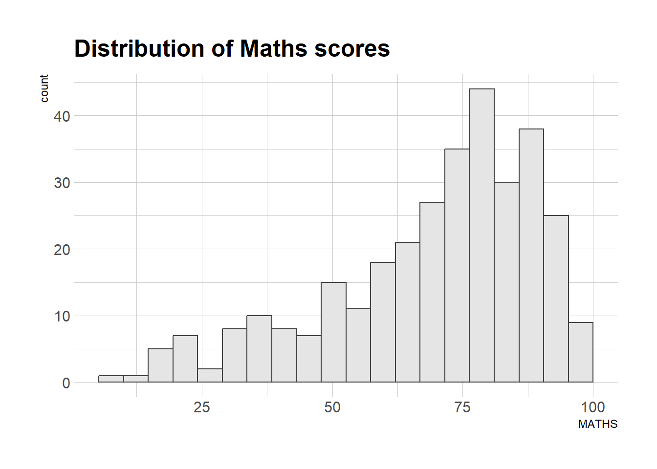
The second goal centers around productivity for a production workflow. In fact, this “production workflow” is the context for where the elements of hrbrthemes should be used. Consult this vignette to learn more.
axis_title_sizeargument is used to increase the font size of the axis title to 18,base_sizeargument is used to increase the default axis label to 15, andgridargument is used to remove the x-axis grid lines.
ggplot(data=exam_data,
             aes(x = MATHS)) +
  geom_histogram(bins=20,
                 boundary = 100,
                 color="grey25",
                 fill="grey90") +
  ggtitle("Distribution of Maths scores") +
  theme_ipsum(axis_title_size = 18,
              base_size = 15,
              grid = "Y")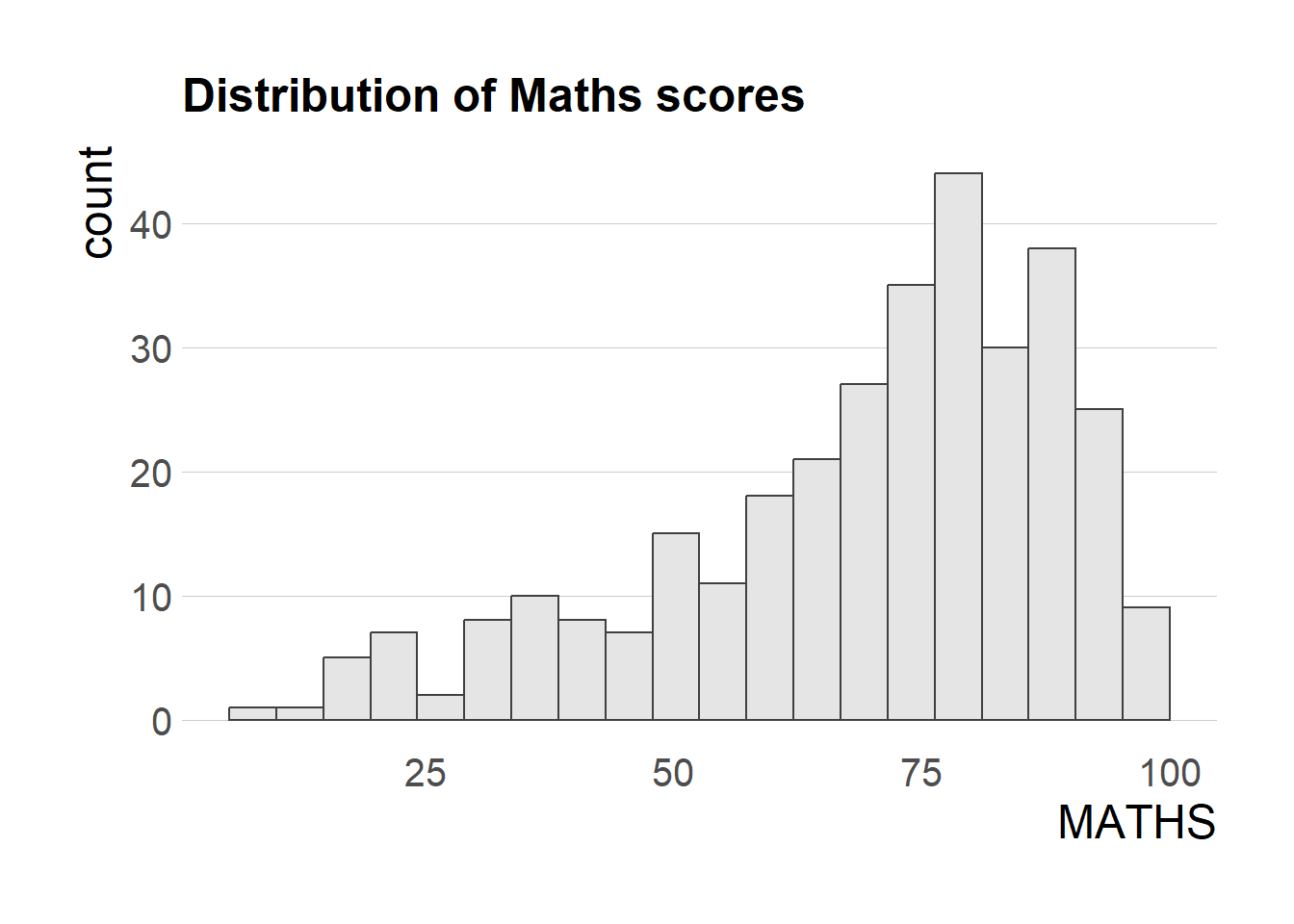
2.6 Creating Multiple Graphs
Sometimes we want to use multiple graphs to tell a story. We will learn how to do this using the patchwork package.
Before we start, we first create the three graphs that we want to use for our data storytelling.
p1 <- ggplot(data=exam_data,
             aes(x = MATHS)) +
  geom_histogram(bins=20,
                 boundary = 100,
                 color="grey25",
                 fill="grey90") +
  coord_cartesian(xlim=c(0,100)) +
  ggtitle("Distribution of Maths scores")

p1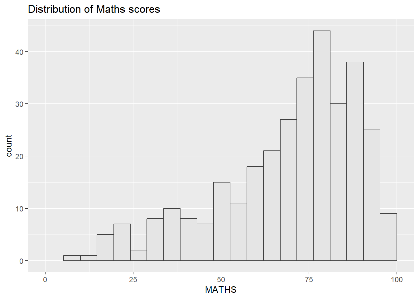
p2 <- ggplot(data=exam_data,
             aes(x = ENGLISH)) +
  geom_histogram(bins=20,
                 boundary = 100,
                 color="grey25",
                 fill="grey90") +
  coord_cartesian(xlim=c(0,100)) +
  ggtitle("Distribution of English scores")

p2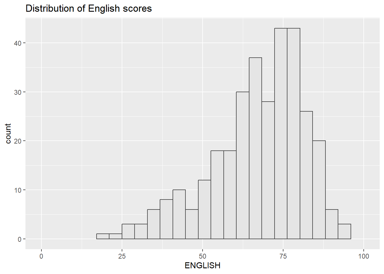
p3 <- ggplot(data=exam_data,
             aes(x= MATHS,
                 y=ENGLISH)) +
  geom_point() +
  geom_smooth(method=lm,
              size=0.5) +
  coord_cartesian(xlim=c(0,100),
                  ylim=c(0,100)) +
  ggtitle("English versus Maths scores")

p3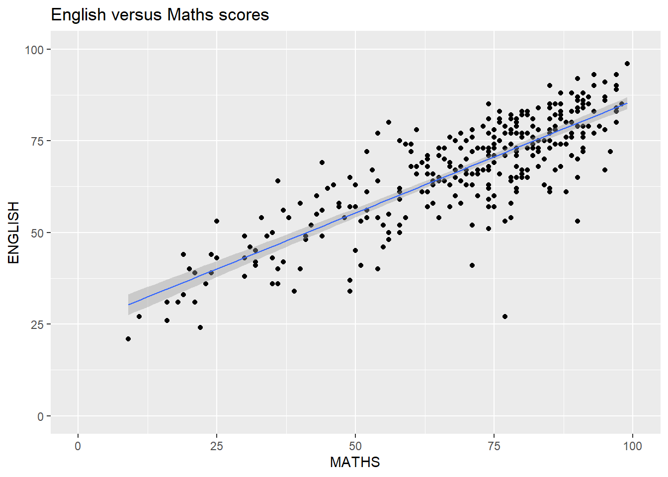
There are several ggplot2 extension’s functions support the needs to prepare composite figure by combining several graphs such as grid.arrange() of gridExtra package and plot_grid() of cowplot package. In this section, I am going to shared with you an ggplot2 extension called patchwork which is specially designed for combining separate ggplot2 graphs into a single figure.
Patchwork package has a very simple syntax where we can create layouts super easily. Here’s the general syntax that combines:
Two-Column Layout using the Plus Sign +.
Parenthesis () to create a subplot group.
Two-Row Layout using the Division Sign
/
2.6.2 Combining two graphs
p1 + p2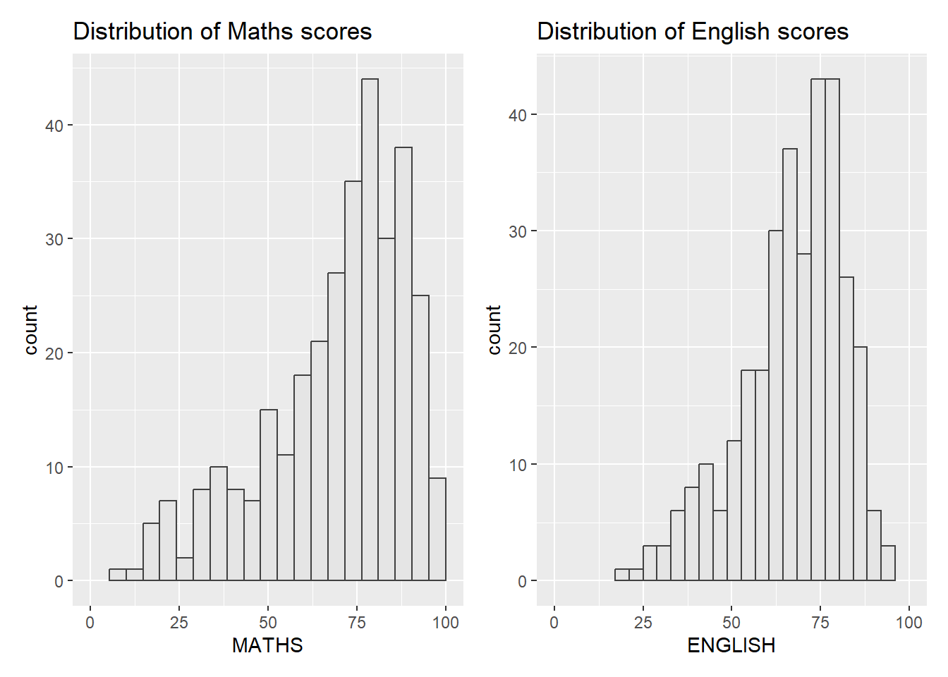
2.6.3 Combining three graphs
We can plot more complex composite by using appropriate operators. For example, the composite figure below is plotted by using:
“/” operator to stack two ggplot2 graphs,
“|” operator to place the plots beside each other,
“()” operator the define the sequence of the plotting.
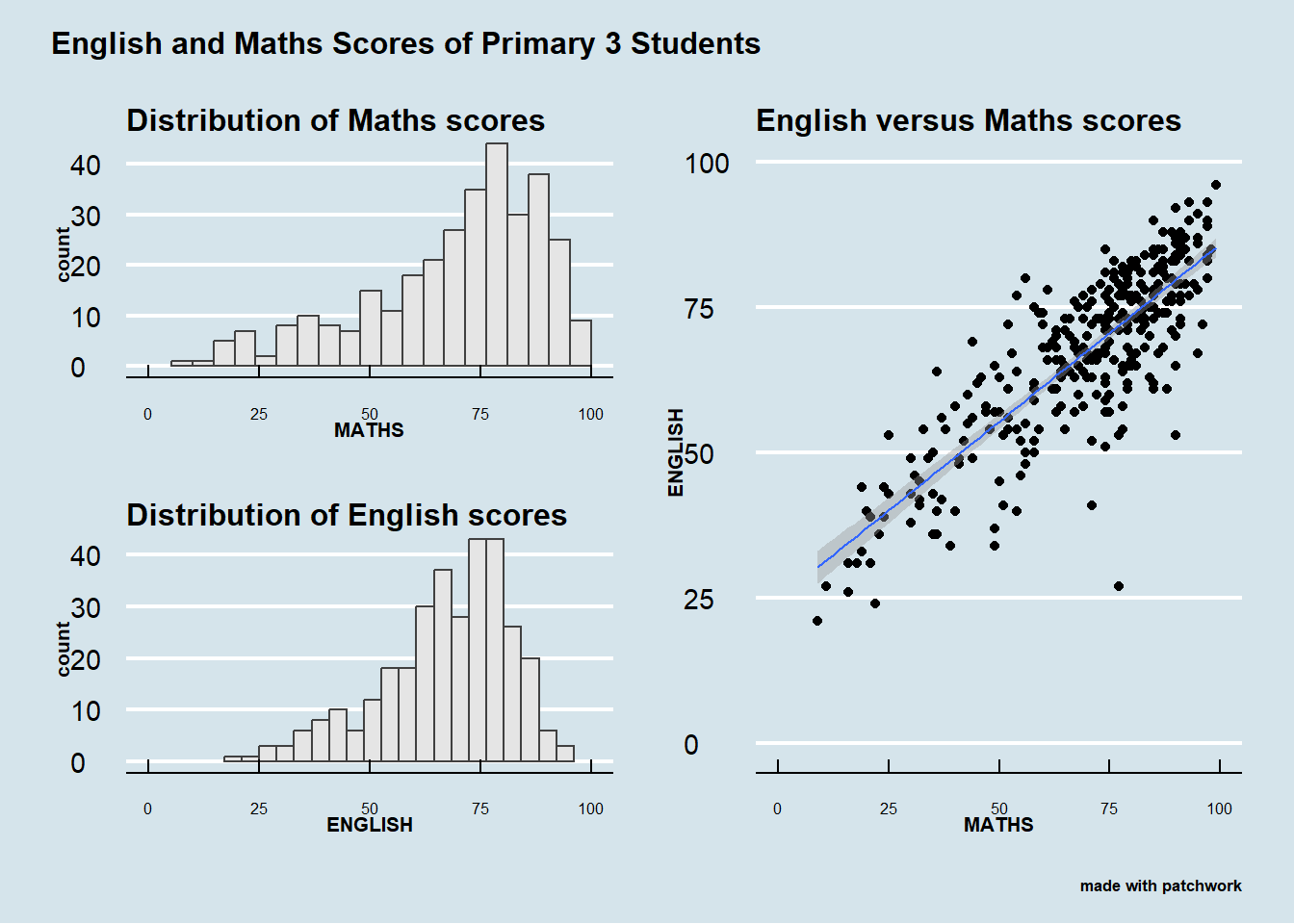
(p1 / p2) | p3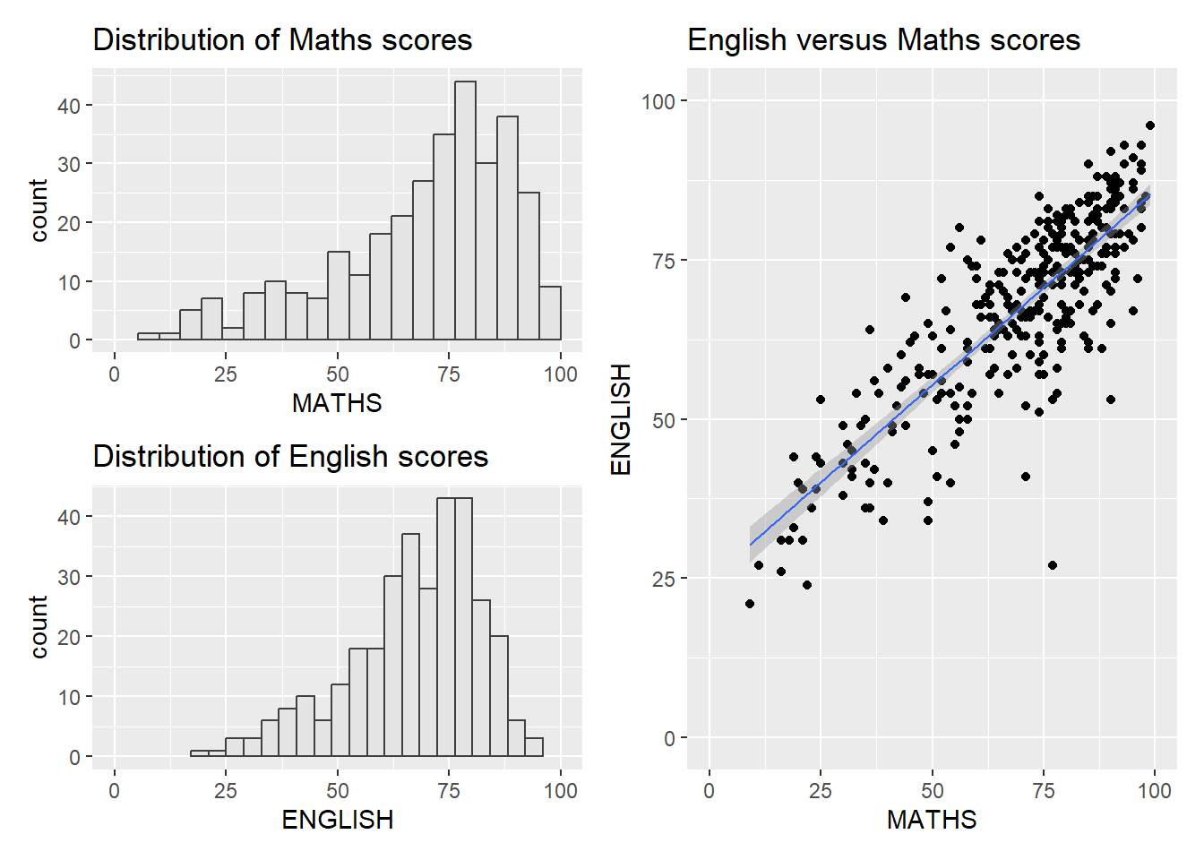
To learn more about, refer to Plot Assembly.
2.6.4 Creating a composite figure with a tag
In order to identify subplots in text, patchwork also provides auto-tagging capabilities as shown in the figure below.
((p1 / p2) | p3) +
  plot_annotation(tag_levels = 'I')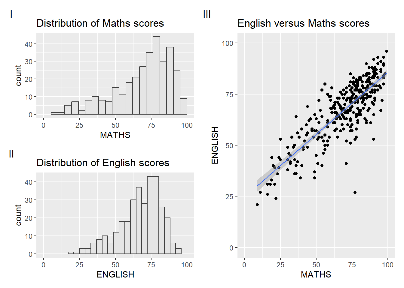
2.6.5 Creating a figure with insert
Beside providing functions to place plots next to each other based on the provided layout. With inset_element() of patchwork, we can place one or several plots or graphic elements freely on top or below another plot.
p3 + inset_element(p2,
                   left = 0.02,
                   bottom = 0.7,
                   right = 0.5,
                   top = 1)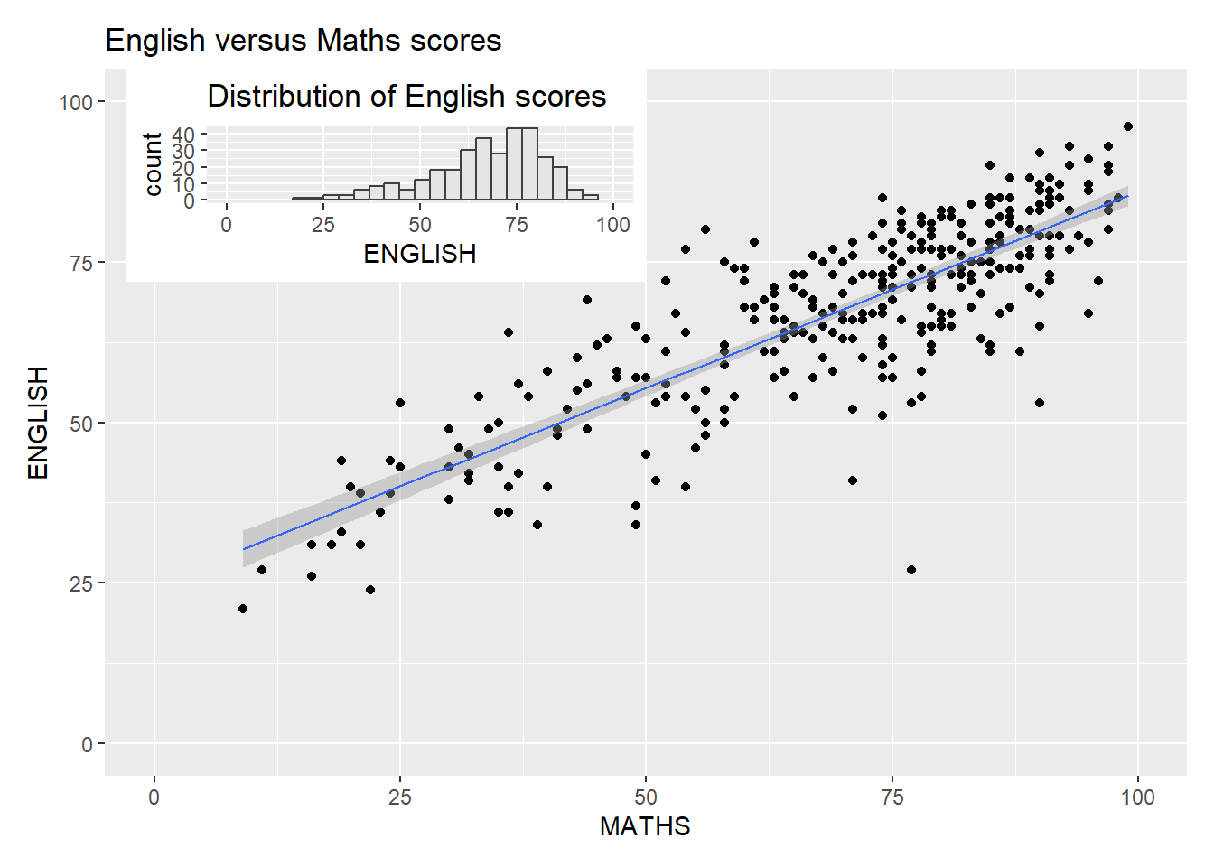
2.6.6 Creating a composite figure by using patchwork and ggtheme
We can combine patchwork and theme_economist() of ggthemes package:
Also note how to create the title and caption under patchwork.
patchwork <- ((p1 / p2) | p3) +
  plot_annotation('English and Maths Scores of Primary 3 Students', caption = 'made with patchwork')

patchwork & theme_economist() +
  theme(title=element_text(size=8, face='bold'), axis.text.x = element_text(size = 6))